Muhammad Rafay


Muhammad Rafay


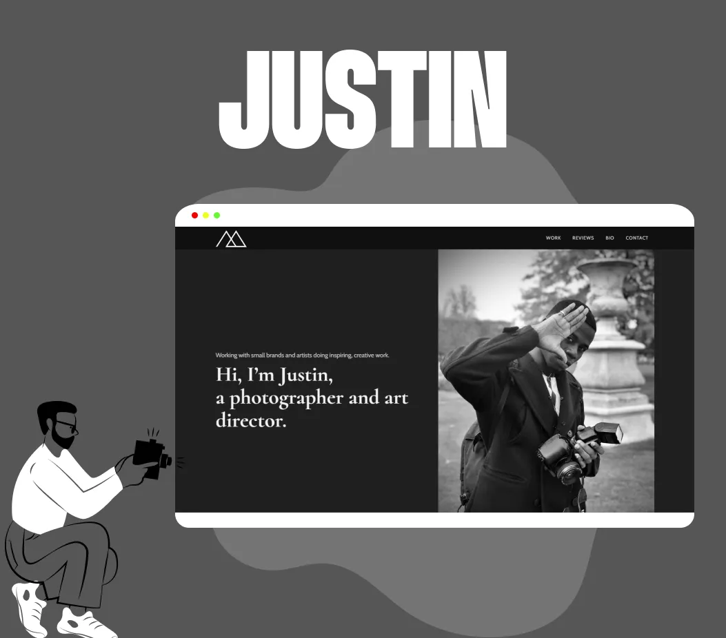
web design
figma to webflow
Adobe XD to Webflow

about
A Passionate Webflow developer specializing in developing beautiful websites. More than 4 years of experience in developing Webflow websites.
Imagining creative ideas and bringing them into the visuals has been my goal since I started building websites on webflow.
Skilled in CMS, interactions, animations, and creating eye-catchy visuals.
What I do
Build from scratch
I will wrap your design into a perfect Webflow website with smooth animations.
Improving and scaling
If you have a website and that needs improvement, I am ready to help!
Technical SEO
I do everything to make PageSpeed Insights and Lighthouse love your site.
Integrations
Need more functionality? I will add necessary services and automate processes.
Ongoing maintenance
I do not abandon my clients after completing work on their website. Come back at any time to make changes, fix bugs, or just edit the content.
No bugs
Although perhaps I can make mistakes, like all people. But I perform Q/A testing, almost all bugs are eliminated before they get to you.
work process


Frequently Asked Questions
What is Webflow?
Webflow is a pro level front-end development tool & CMS that allows us to visually develop and complete tasks faster, while improving the quality of our code and creativity of front-end designs.
How long does it take to build a new webflow website?
The average site development time is 2-3 weeks. For most small sites, 2 weeks will be enough. Of course, the development time strongly depends on the number of pages, blocks on them and their complexity. A large website with complex functionality and integrations can take more than a month.
What if you don't have the mobile version of the screen in the design?
Absolutely, it will be even better for me and the speed of website creation. I will adapt your design to all screen sizes in the most optimal way. I recommend providing a mobile design for individual complex elements of the site.
What sizes of the website will be in responsive design?
When creating frames for different screen resolutions, it's worth considering breakpoints supported by Webflow. They cannot be changed.
Desktop: 992+ px
Tablet: 768 - 991 px
Mobile landscape: 480 - 767 px
Mobile portrait: 360 - 479 px
I can also add one or more desktop breakpoints: 1280, 1440 and 1920 px.